The Sage
The Sage
The Sage
The Sage
Service
Visual Identity Design, Print & Collateral Design
Client
Tishman Speyer
Year
2024
Service
Visual Identity Design, Print & Collateral Design
Client
Tishman Speyer
Year
2024
Service
Visual Identity Design, Print & Collateral Design
Client
Tishman Speyer
Year
2024
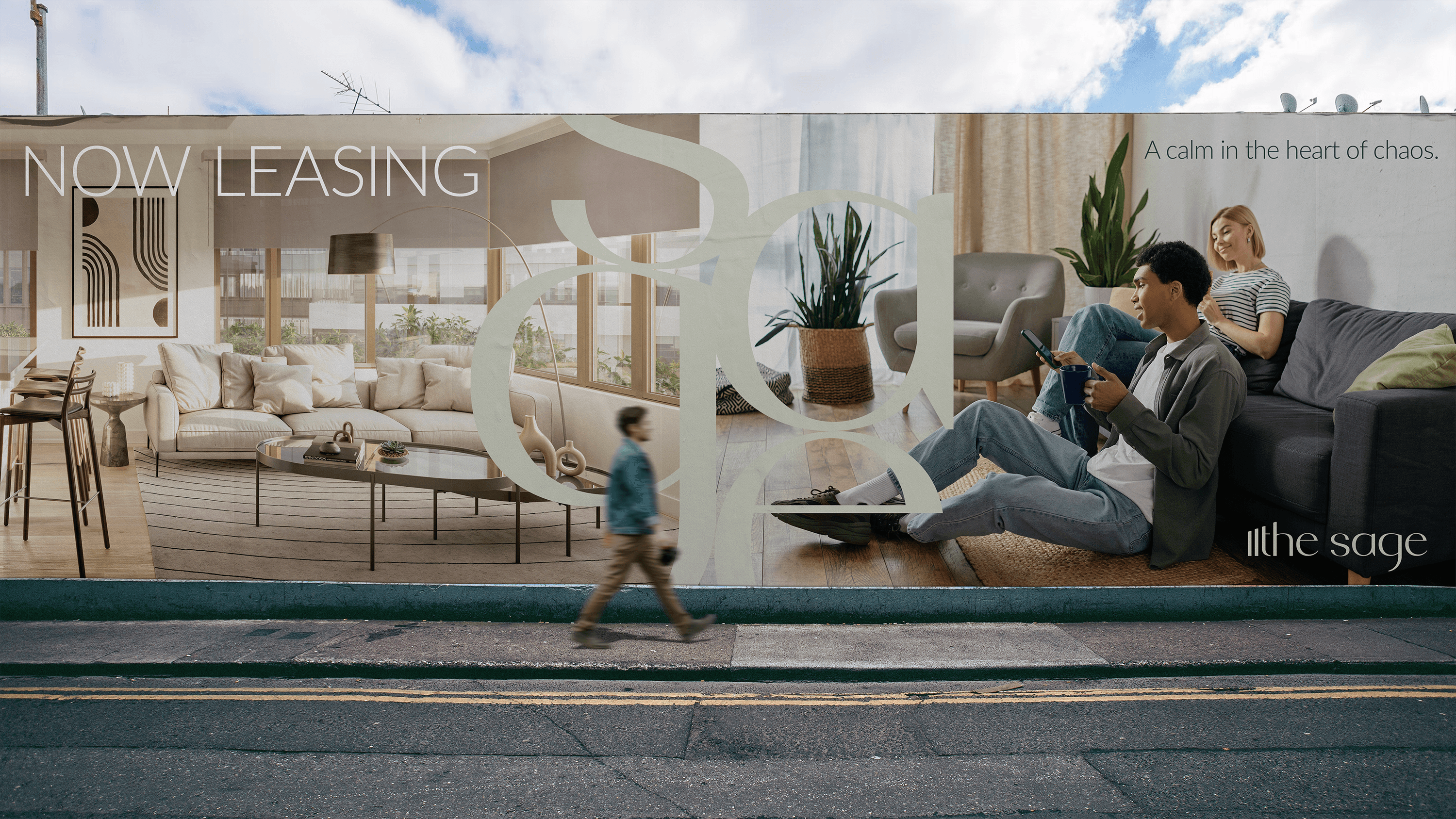
A calm in the heart of chaos.
For their new luxury apartment development, The Sage, the client sought a brand identity that evoked its vision: a serene retreat amidst the hustle and bustle of urban life.
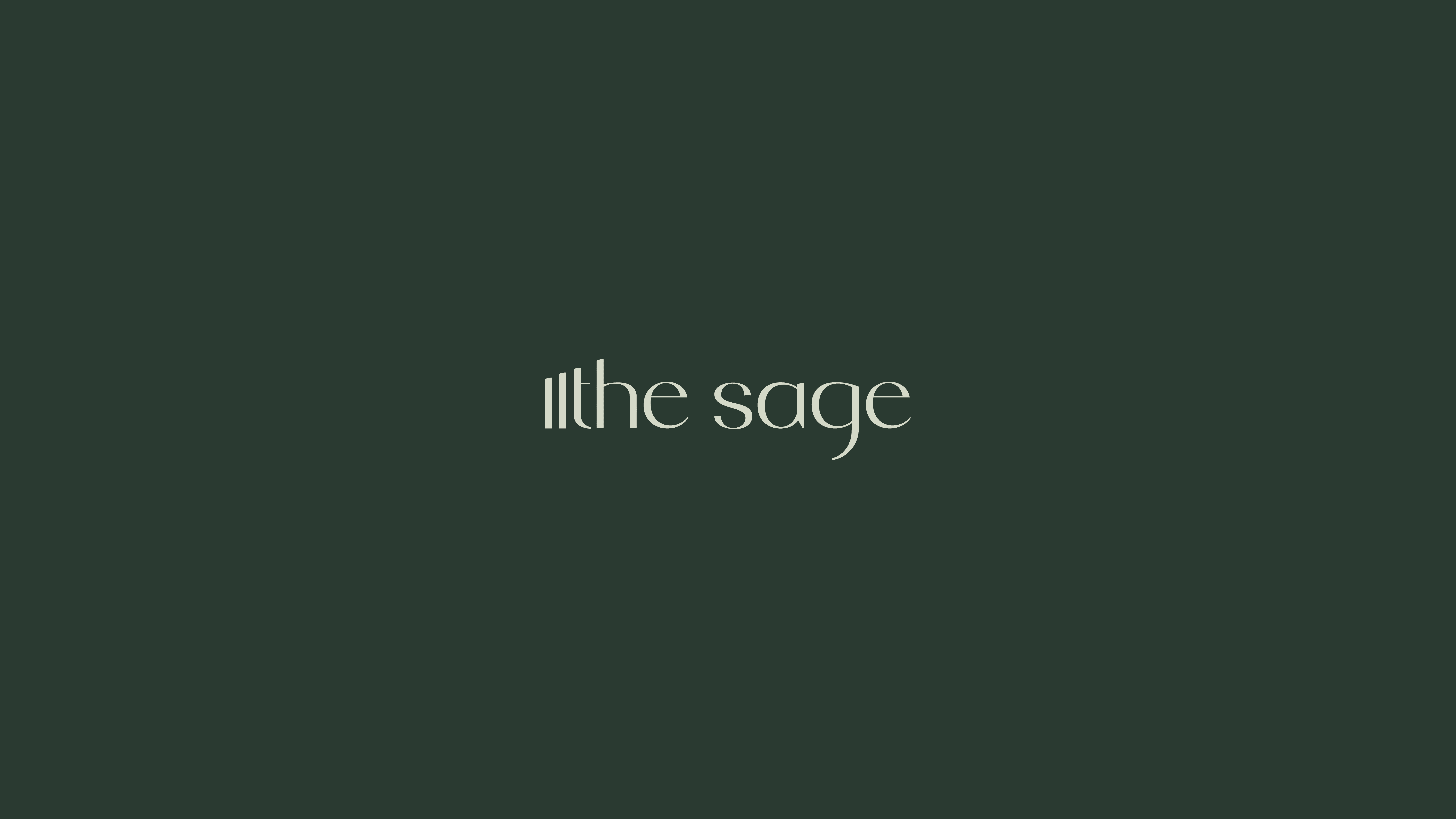
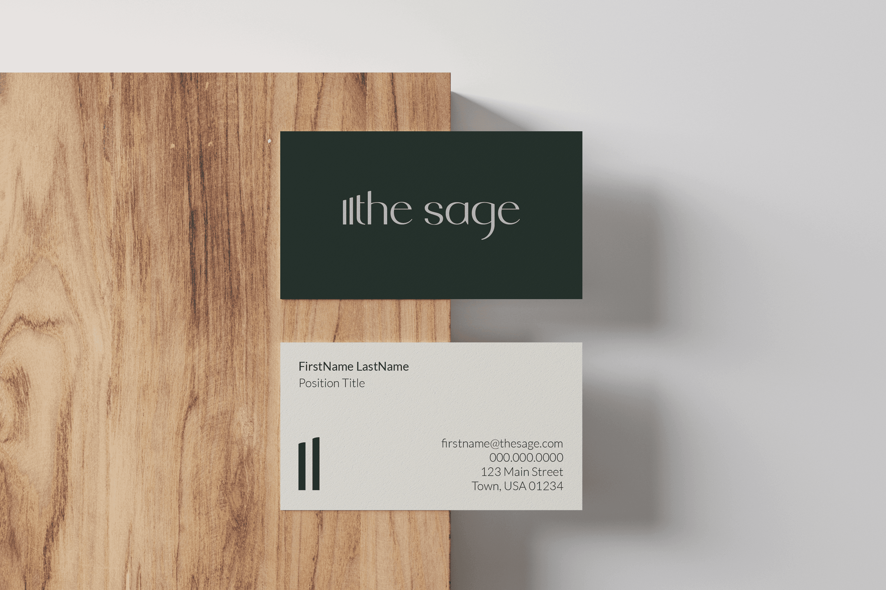
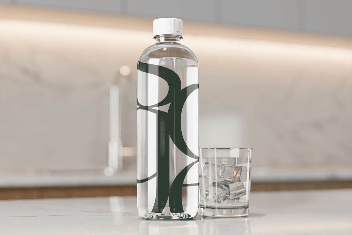
The brand blends the architectural elements of the two building development, while maintaining a sense of serenity. Inspired by the name, the design reflects tranquility, wisdom, and the calmness of home. The color palette combines complementary tones of sage green and ecru, while the typography embodies an organic elegance.
Every element of the brand, from the logo itself to various marketing materials, was thoughtfully designed to appeal to potential residents. The brand identity for The Sage communicates not just a place to live, but a lifestyle of elevated comfort.
A calm in the heart of chaos.
For their new luxury apartment development, The Sage, the client sought a brand identity that evoked its vision: a serene retreat amidst the hustle and bustle of urban life.
The brand blends the architectural elements of the two building development, while maintaining a sense of serenity. Inspired by the name, the design reflects tranquility, wisdom, and the calmness of home. The color palette combines complementary tones of sage green and ecru, while the typography embodies an organic elegance.
Every element of the brand, from the logo itself to various marketing materials, was thoughtfully designed to appeal to potential residents. The brand identity for The Sage communicates not just a place to live, but a lifestyle of elevated comfort.